Original prints in the East Coast Open consistently win
I submitted art to the juried exhibition held in Scarborough's Art Gallery for a few years in succession with much success.
I've not entered art into this Open for quite a few years, so the reviews are past, while the art is present.
The last I knew, they had proposed moving this art show from its regular slot in January to before Christmas. That's a while ago.
Updating this page as part of a website refresh and upgrade, has prompted me to investigate the current state of this exhibition. It's now in the Summer as of 2023! And after the disturbance of covid, it's back on track by the looks of it. That's great.
Story of my life – the submission window for 2023's exhibition closed yesterday – life's all about timing and mine is jinxed!
I fully intend to become a fixture of the show again in future. Scarborough is a lovely seaside town with much to interest an artist.
I'm usually painting in the location at some point during the year, and there's many-many more paintings calling to me whenever I'm there on other business.
Scarborough is yet another gem full of scenic compositions that's largely ignored by artists, imho. That's good, it means it's all mine!
Exhibition to lift the spirits – an art review
IT is that time of year when we need a lift to the spirits, when the light is poor and we are longing for some colour and warmth. So go to this show and feast on some exciting artwork. It is the best ever and deserves a high profile.
As I recall I entered two linocut prints this particular year. One was accepted - which I picked up on Reject Return Day, and submitted that same day to Ferens Open down the coast.
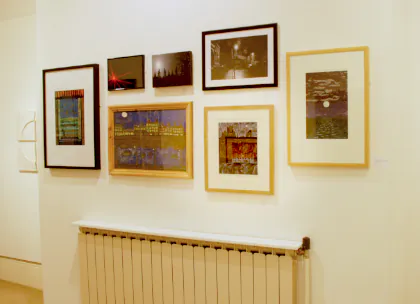
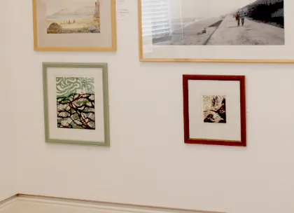
Above: My photography skills were not what they are today. The least of the problems with this picture, but an unfortunate reflection of an artwork opposite confuses the print. It's one of the two framed the same (we used the same framer!), beneath another artwork.
Review of the East Coast Open, January
Each room of the gallery has its own distinct energy and colour theme.
The selectors have chosen a picture from the gallery collection to be a guide, with helpful notes to give depth to the themes. This is such a welcome idea, not often used in an open exhibition [ … ]
There are usually several hundred artist's shown in one of these exhibitions. Reviewers do not name them all as a practice. So to have your artwork pulled‑out by Christine for mention at all is an achievement.
It means your art stood out from all the rest in a good way, and given the usually high quality art (and it always was at the East Coast Open) it's especially commending.
I confess to having struggled with the theme of Light, with the example of the Black Mirror to start one off! But I loved the Bedtime Stories by Lynne Roebuck [ … ]
Heath, Christine (2010). “Exhibition to lift the spirits” Scarborough Evening News. January 27, 2010.
The rejected linocut was accepted at Ferens during the next fortnight, and sold from the exhibition. That's the way of these juried art shows. The accepted one: "Bedtime Stories", the rejected one: Coast
Simple and direct delight
In an otherwise luke warm review of the East Coast Open '08, my original prints proved a hit with the critic.
This was only the second time I'd entered a juried art exhibition. It was a bi-annual event, and after succeeding the very first time, I was up for trying for a second triumph.
I submitted three artworks and had two prints accepted. The one refused was a painting.
I wasn't at all surprised the painting was rejected, because even though it was a decent painting I was pleased with, the composition was a bit 'challenging' for the viewer.
A tree with no artistic composition sense at all insisted on being in the wrong place, while everything else arranged itself impeccably. Trees are like that.
Juried art selection in seconds
I've digressed a little chelping*Northern UK term for 'chattering' about trees, but there's a point here on how these exibitions are selected.
I made a decision to paint the tree in, and it set up a challenging visual division in the painting.
Thousands of artworks are submitted to these shows, and the jury have about six hours to select 250 out of 5000, and often more. My maths says that's 5 seconds a picture. Even if they're given two days, a 10 second debate about a compositionally challenging artwork isn't possible.
As I said, I wasn't surprised it was rejected. I might tackle the artwork again out of curiosity. Me and that tree will have words.
(Don't panic, trees are my friends, I hate to see them destroyed… or even feeling a bit wounded)
A contentious Exhibition review
I doubt this was received well by the gallery. I've chosen only the part of it relevant to my artwork, though it was all in much the same vein.
…room three gives us seascapes by the slack handful, like a jumbled history of painting from 1800 to now. Again, it’s the simple, direct works that appeal most.
Above: Early prints, I'd been making prints for only just over two years at the time. To be honest, I'm thinking of returning to this simple, direct style in some form.
Look out too for Lynne Roebuck’s delightfully simple linocuts and [ another artist's ] screenprints, both showing that colour isn’t everything.
Osbourne, Roger (2008). “Swirls of colour but is there enough bite?” High Tide arts magazine. February, pp 7
Both of these prints were what's called “printmaker's proofs”, and I decided against making the editions. That means they're unique one‑of‑a‑kind prints (Both sold).